Fast Food Restaurant
2020-2021


Overview
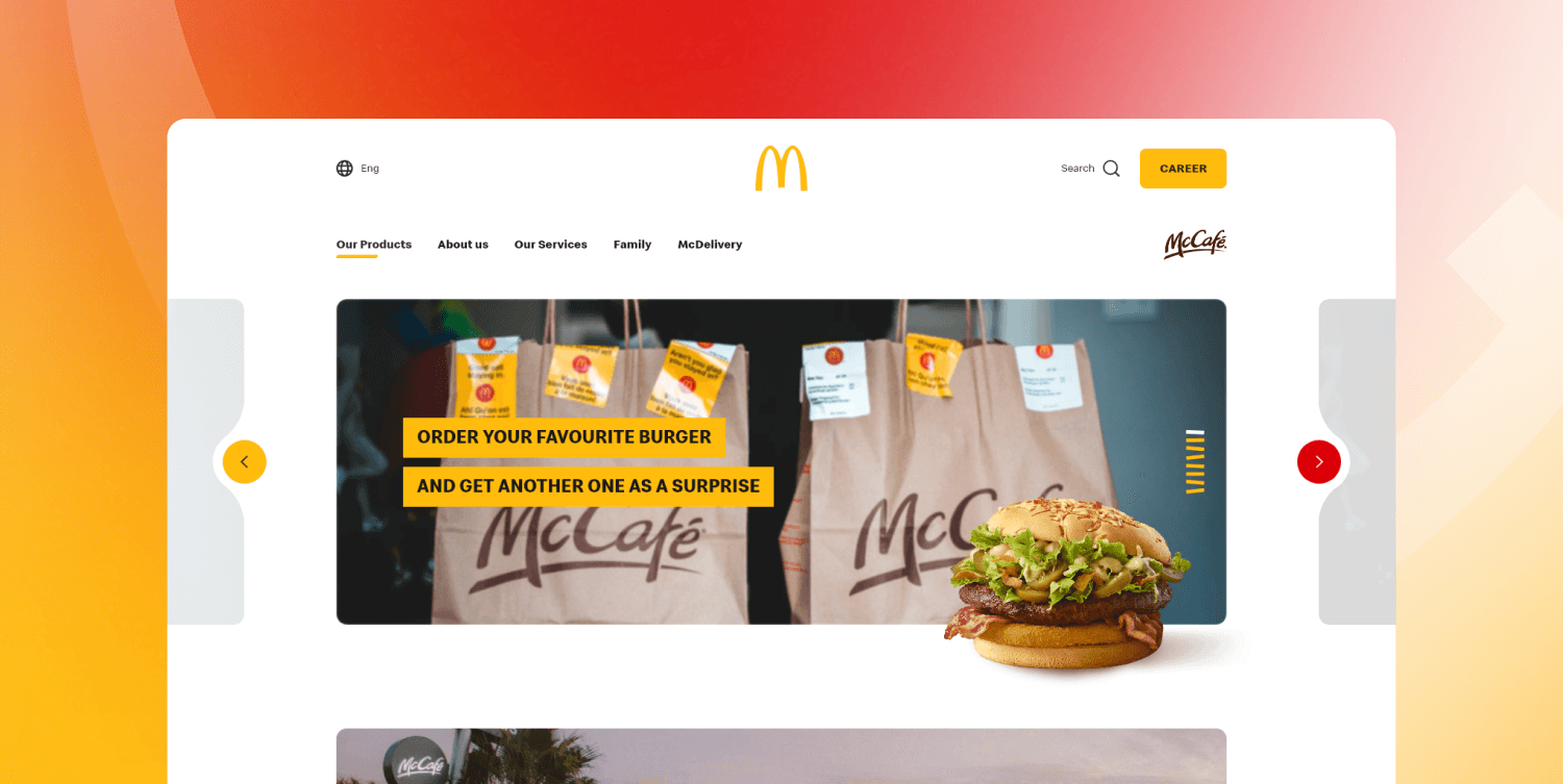
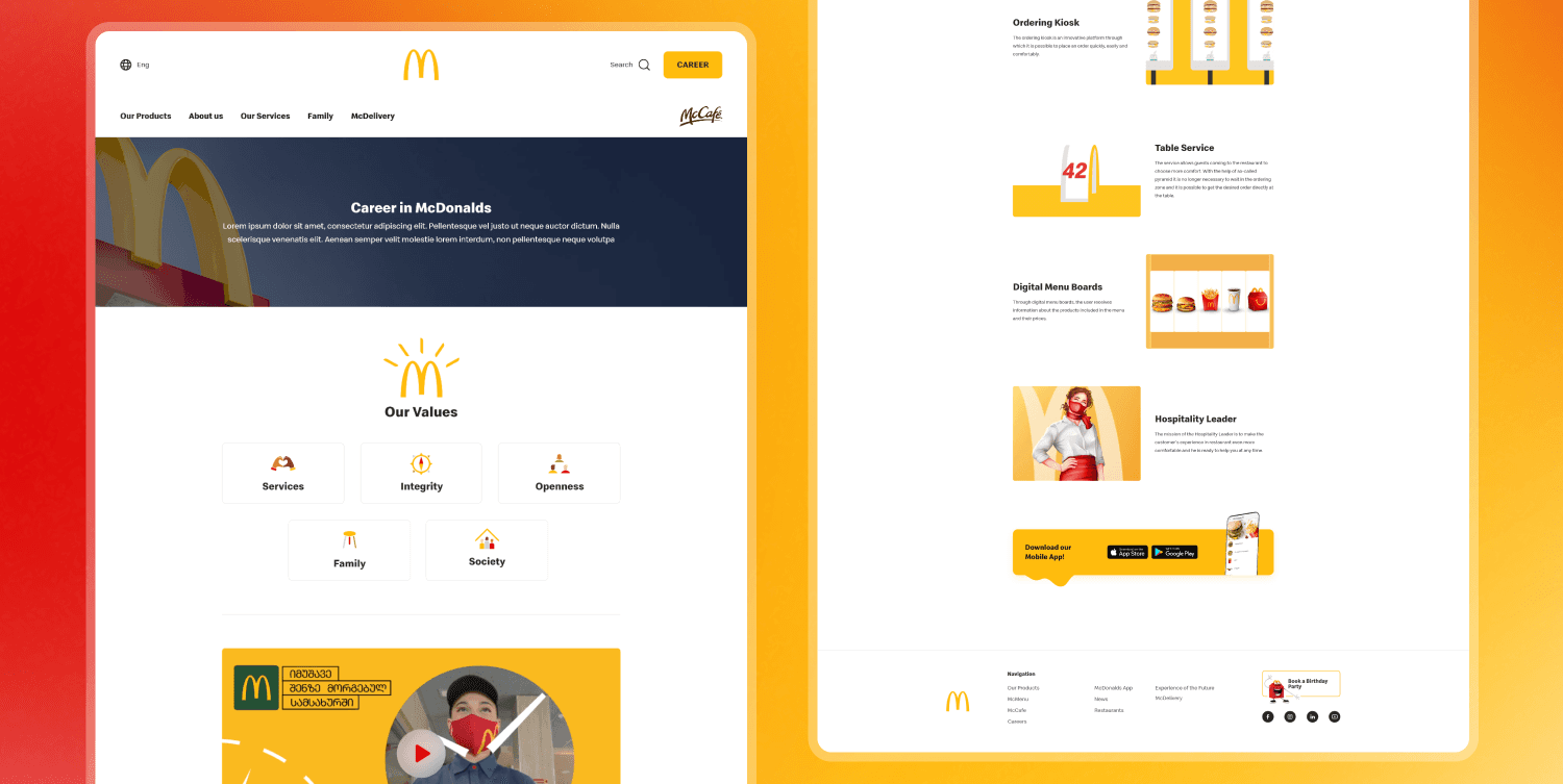
McDonald's is one of the most beloved fast-food chains worldwide, including in Georgia. With the recent update to their brand guidelines, McDonald’s Georgia took the opportunity to completely refresh their website. The previous design had grown outdated, with users struggling to find the information they needed. The lack of white space made the site feel cluttered, creating a frustrating navigation experience for customers. The revamp aimed to bring a modern, user-friendly approach, making information more accessible and the browsing experience smoother.
Problem
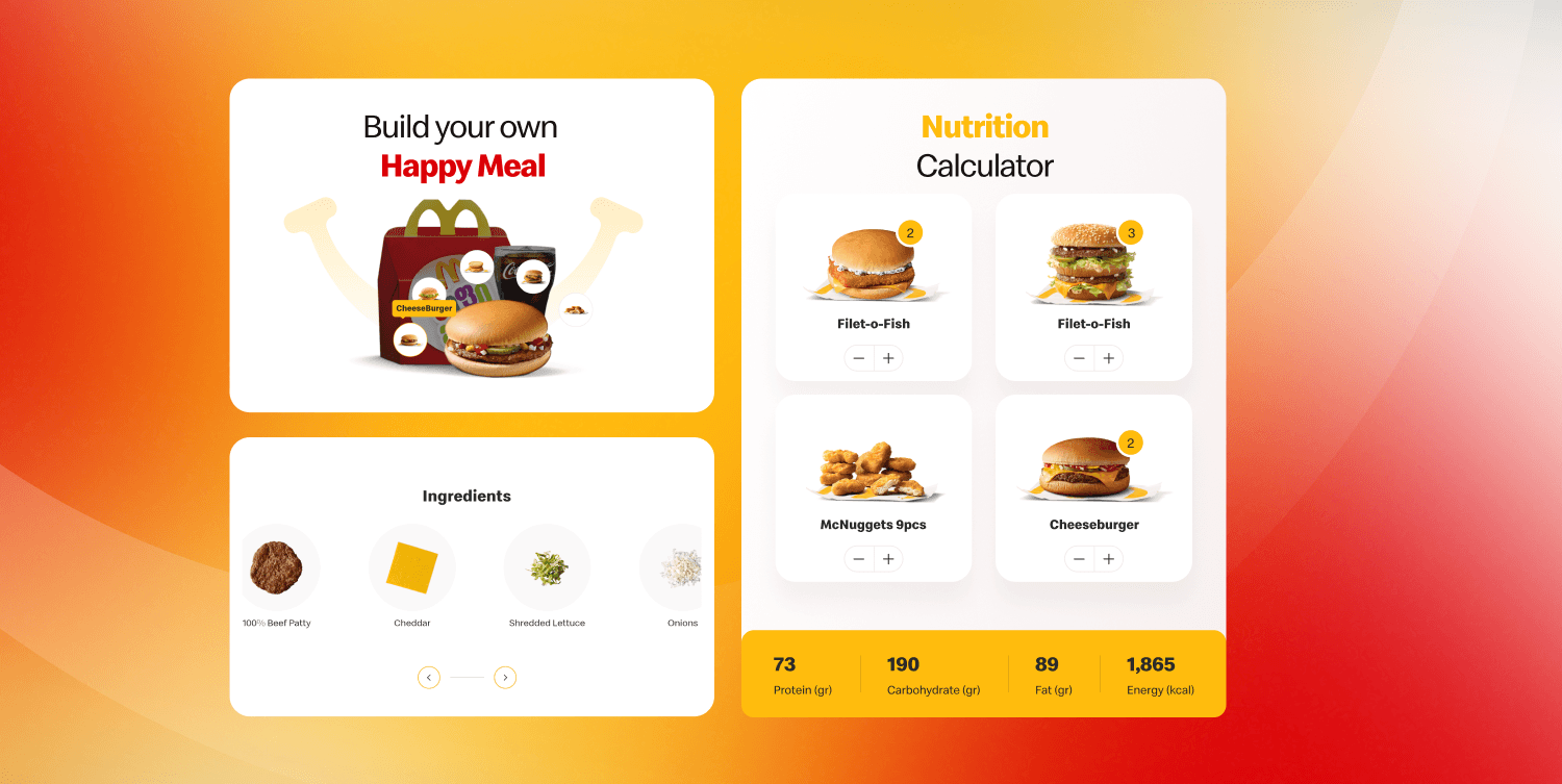
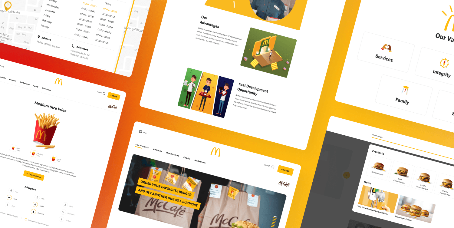
Customers often struggled to find information about Happy Meals and the nutritional content, frequently reaching out through social media or by phone. To address this, McDonald's launched a dedicated marketing campaign, and I had the opportunity to play a key role as the Designer. My focus was on making the information not only clearer and more readable but also fun and exciting, aligning with the playful spirit of the brand. The result was a vibrant, engaging design that brought important details to life in a way that resonated with both kids and parents
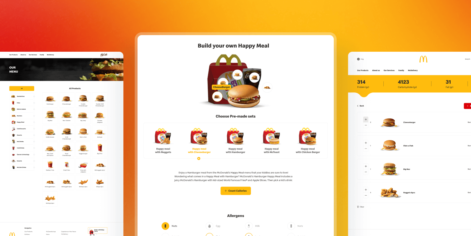
To improve the experience, I completely redesigned the product details page, organizing key information to be easily scannable at a glance. One standout feature was a unique "Build Your Own Happy Meal" experience. The Happy Meal became a hit with users, as it allowed them to discover that they could fully customize their order, including their choice of sandwich and drink. To enhance familiarity, I designed the product listing page to mimic the kiosk experience, making it easy for customers who are accustomed to ordering that way. This personalized approach made the process more interactive and enjoyable. I also integrated detailed information on ingredients and allergens, along with a smooth, user-friendly nutrition calculator that made tracking nutritional content a breeze. The result was an intuitive, engaging, and informative experience.
Micro-animations added a special flair to the design, making it stand out and feel more engaging. These subtle movements brought the interface to life, making interactions smoother and more fun. They weren’t just eye-catching; they made the experience more memorable, leaving users with a lasting impression while guiding them effortlessly through the site
Some of the pages were packed with information, making them a bit overwhelming for users. To tackle this, I created informative templates that not only streamlined the content but also provided a clear structure for future use. This way, as McDonald's planned to expand and add more information, these templates would ensure everything stayed organized and user-friendly. It was a proactive step to keep the site scalable while maintaining an enjoyable experience for visitors.
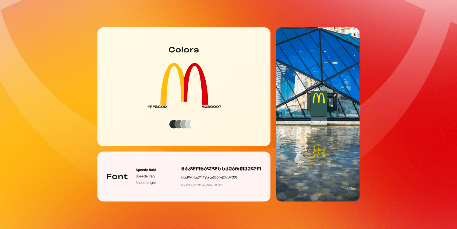
In the end, I achieved a sleek and modern design that perfectly aligns with McDonald's new brand guidelines. The look and feel of the website are now fresh and inviting, enhancing the overall user experience.
Analytics tools show that users can effortlessly navigate the site and reach their goals, whether it’s finding their favorite product or customizing a Happy Meal. The improvements have not only made the website more attractive but also more functional, making it a win-win for both the brand and its customers!
