Photo Printing Service
2022-2023


Overview
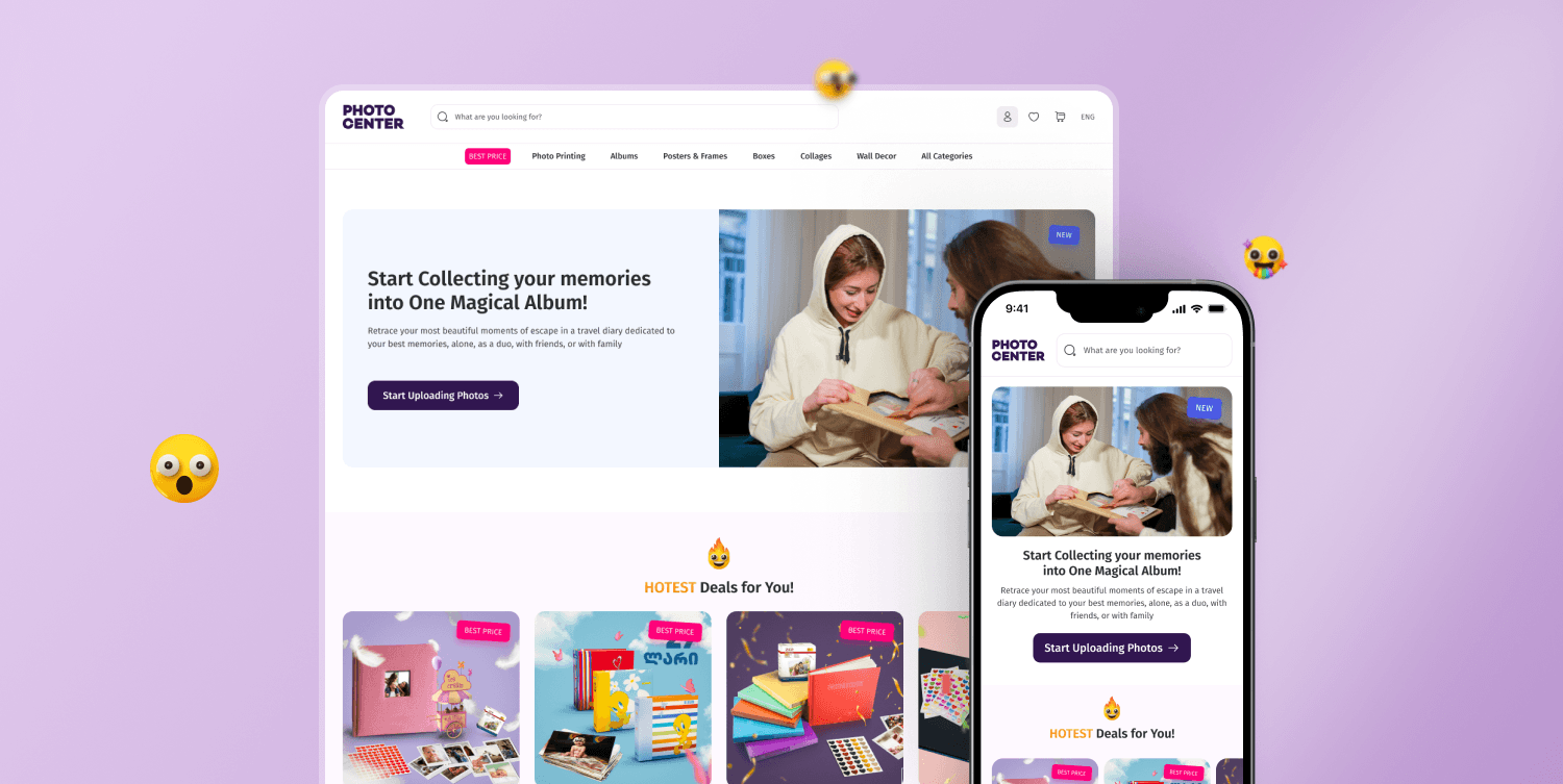
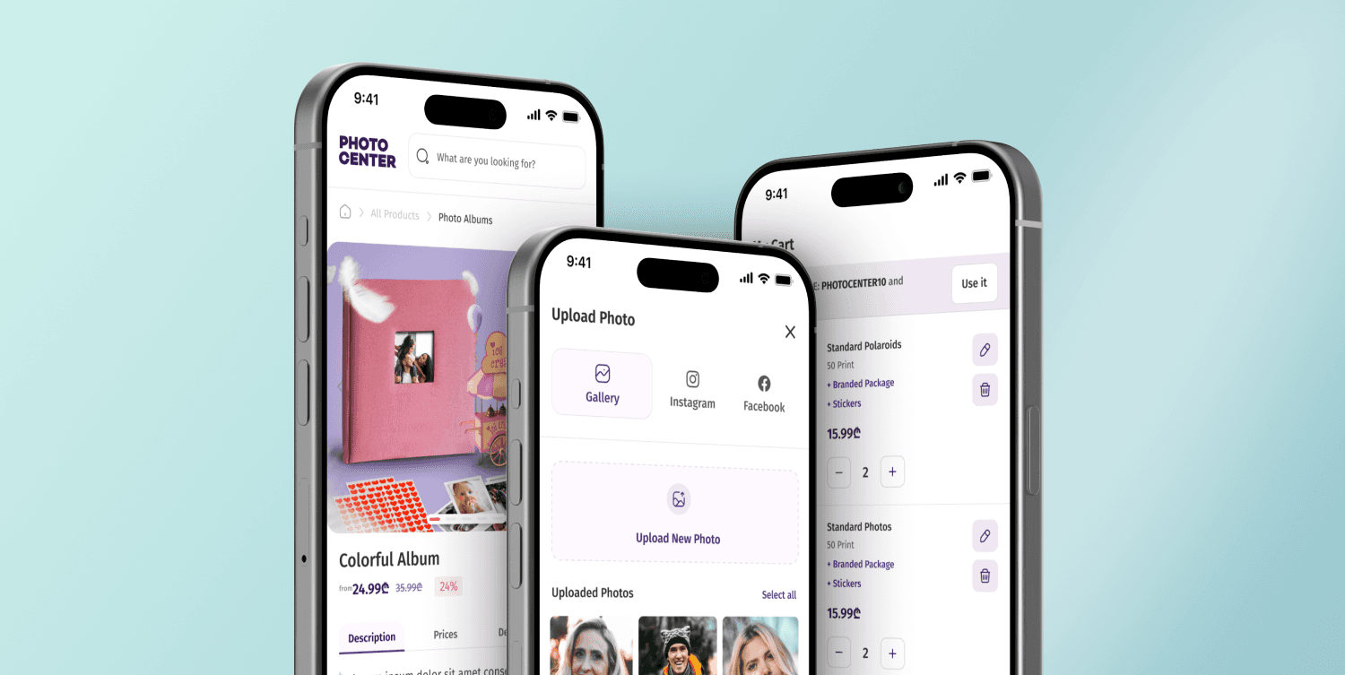
I'll be biased, but this project holds a special place as one of my favorite and most meaningful experiences in my design career so far. To share a bit of backstory, Photocenter was my first-ever freelance client five years ago. They trusted me when I was just a junior, and I literally did everything I could to make them happy and ensure the product worked. After that, we kept in touch for years. A year ago, I reached out to them, hoping to fix my old designs and address the UX issues, as well as update the outdated design. I had gained so much experience over those five years, and I knew that if I had the chance to redo it, I could make it 100 times better! I scheduled a 30-minute call with them, shared my enthusiasm and passion for redesigning my old work, and they agreed!
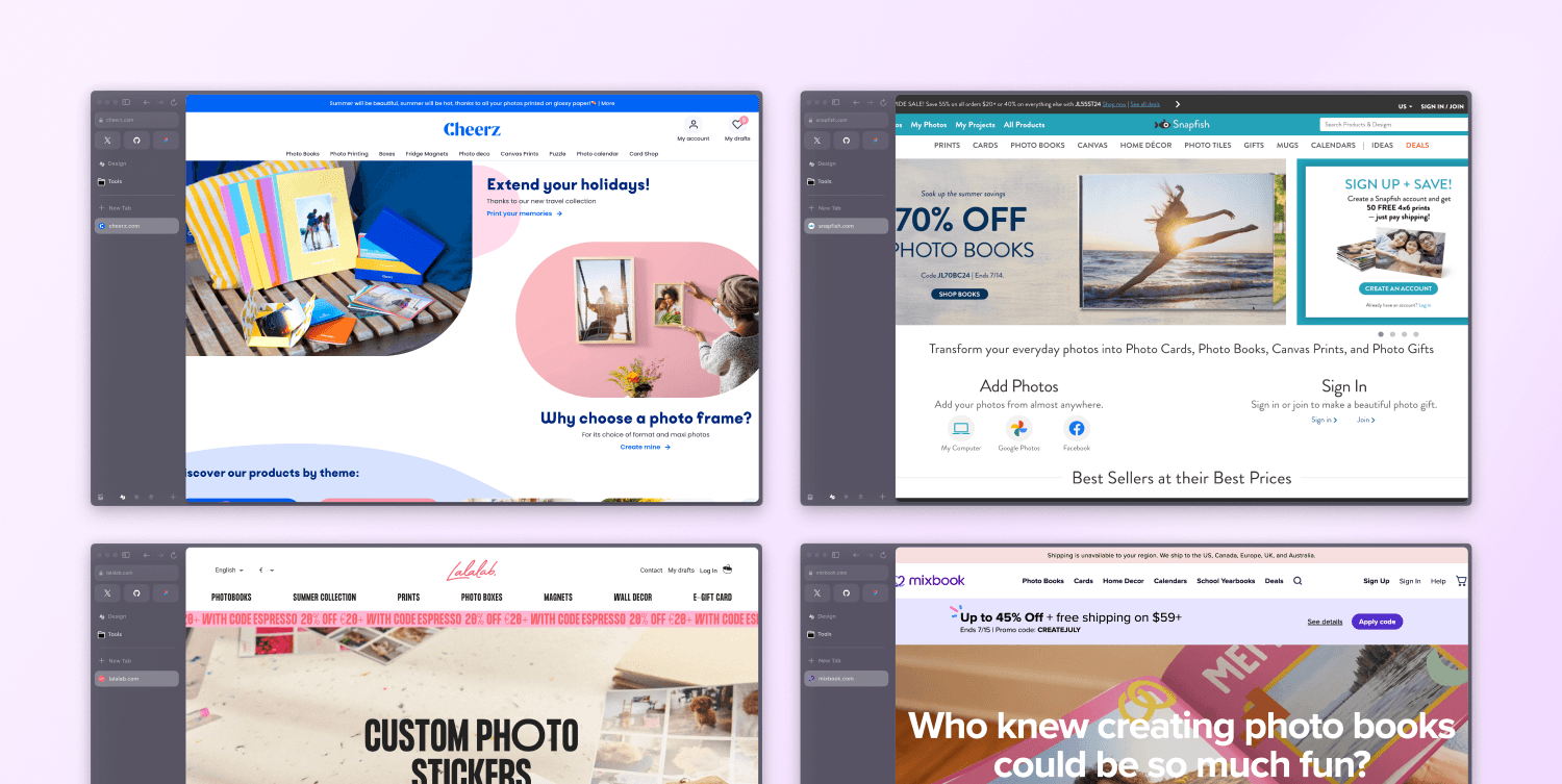
Competitor Analysis:
The first step in the design process was to analyze other competitors both within the region and beyond. By studying the best practices from these companies, I aimed to learn what they were doing well and how I could leverage their successes in my project. By understanding their strengths, I could incorporate proven techniques and innovative ideas into my own work, ensuring that our platform stood out and provided an exceptional user experience
Quantitative Research:
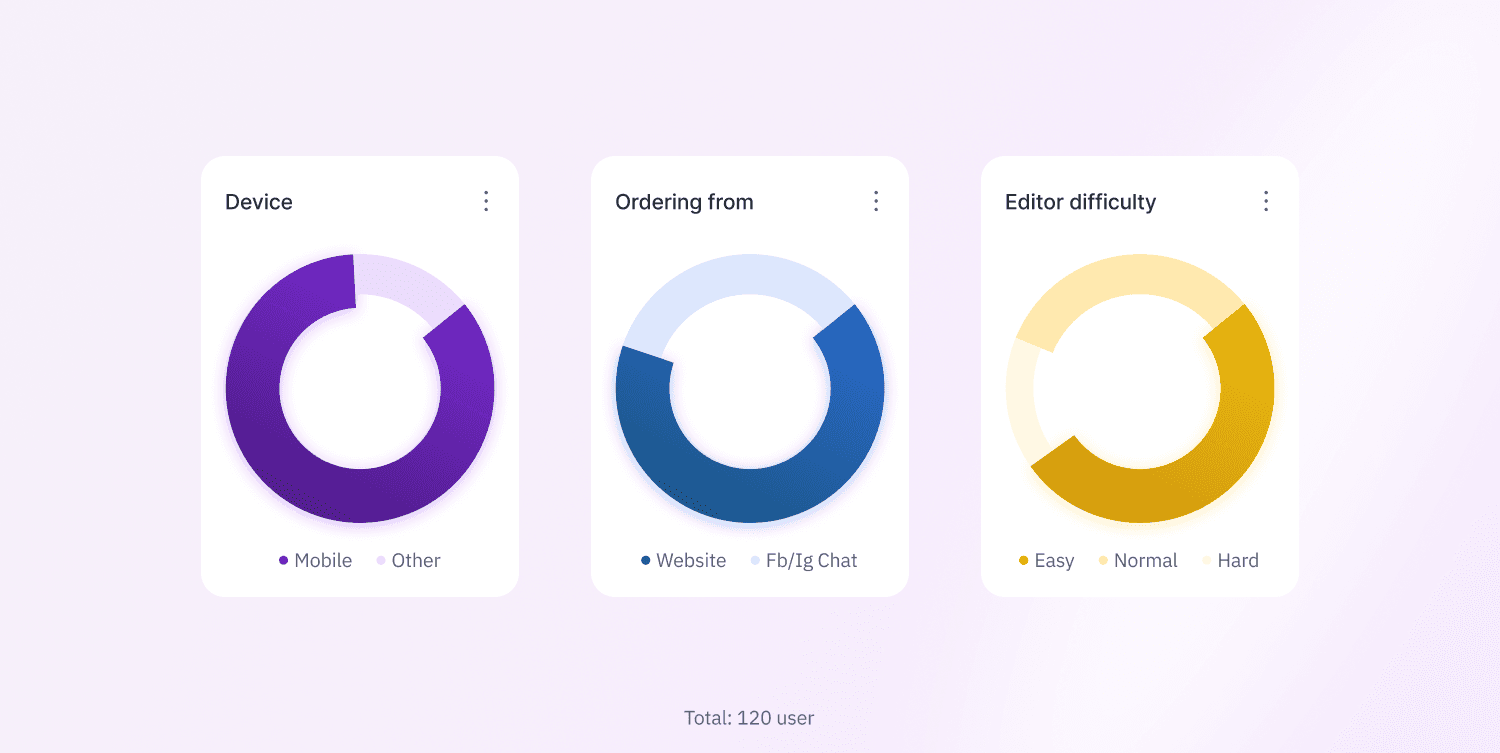
Since it was my design I already knew existing problems that needed to be solved, but at the same time, the company received a lot of feedback from users over the last 4 years. I took the major feedback from users and additionally, I did quantitative research among the 120 users in total, to clarify some concerns.
The research showed us that
85% of users visit our website using their phones/tablets
Communication during the product ordering process needs improvement: The site doesn’t provide real-time status updates, leaving users confused about their progress. This has led many to prefer ordering through Instagram or Facebook.
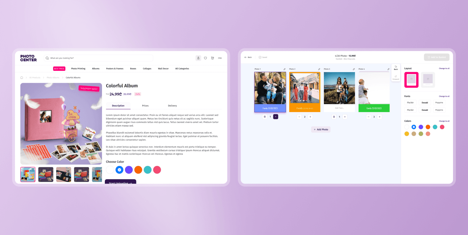
The editor is confusing for some users, leading to mistakes: We've had instances where users accidentally ordered 25 duplicates of a single photo. This caused issues when they received their products.
Finding the "All Products" page on the homepage is challenging: Once users find it, they lack options to filter products, making it hard to navigate.
Upsells are present at almost every step of the purchase process: From choosing photo/frame size, in the editor, and at checkout. Some users were frustrated by add-ons changing the price without clear notification.
Solution:
In the early stages, I focused heavily on how everything looked and worked on mobile. This saved me a lot of time later in the design process.
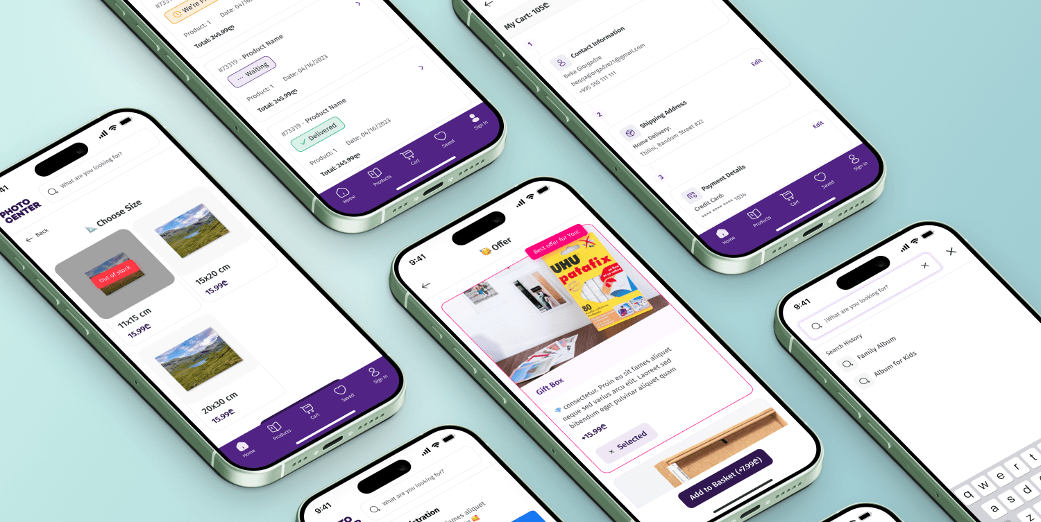
I decided to implement in-app communication on the most important pages, like choosing the product, the editor, and checkout. Using popups, the site often gives users feedback, suggests options, and double-checks if they made unusual decisions. For example, if a user uploads pictures but hasn’t chosen a border color or repositioned the picture to fit the frame, a popup will remind them. We integrated over 20 smart popups to guide users through the ordering process.
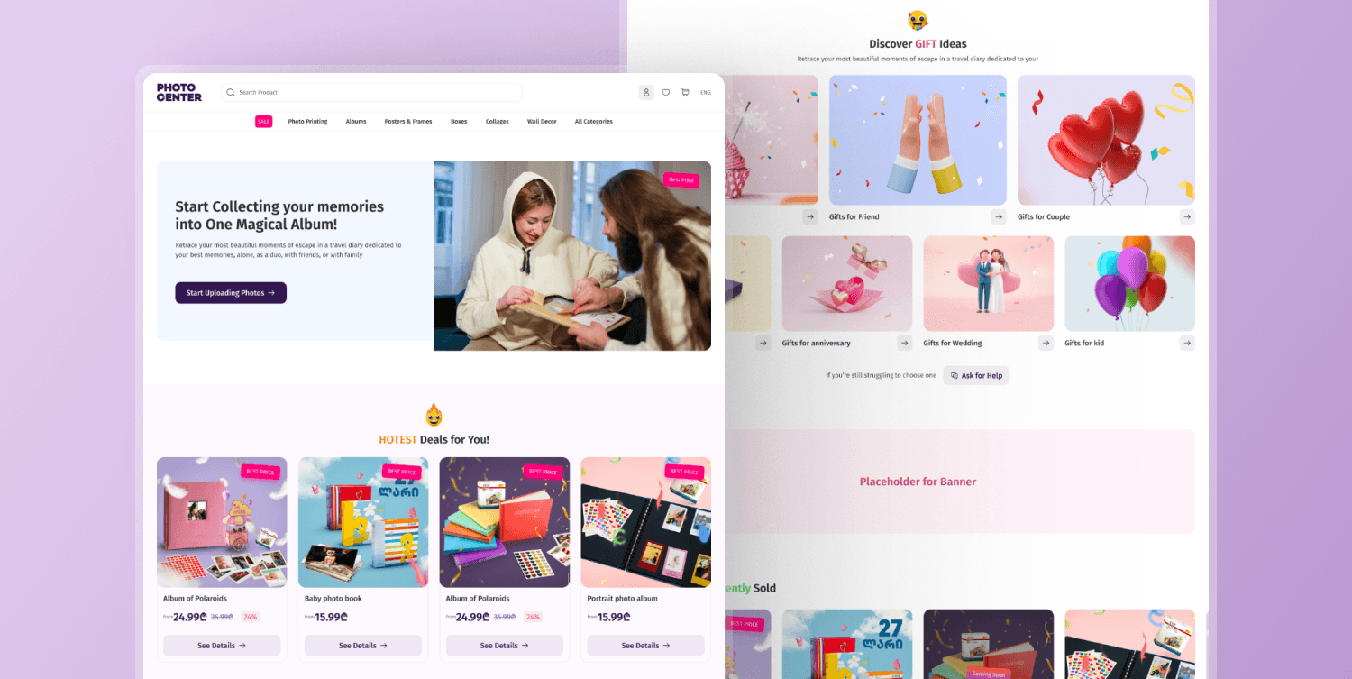
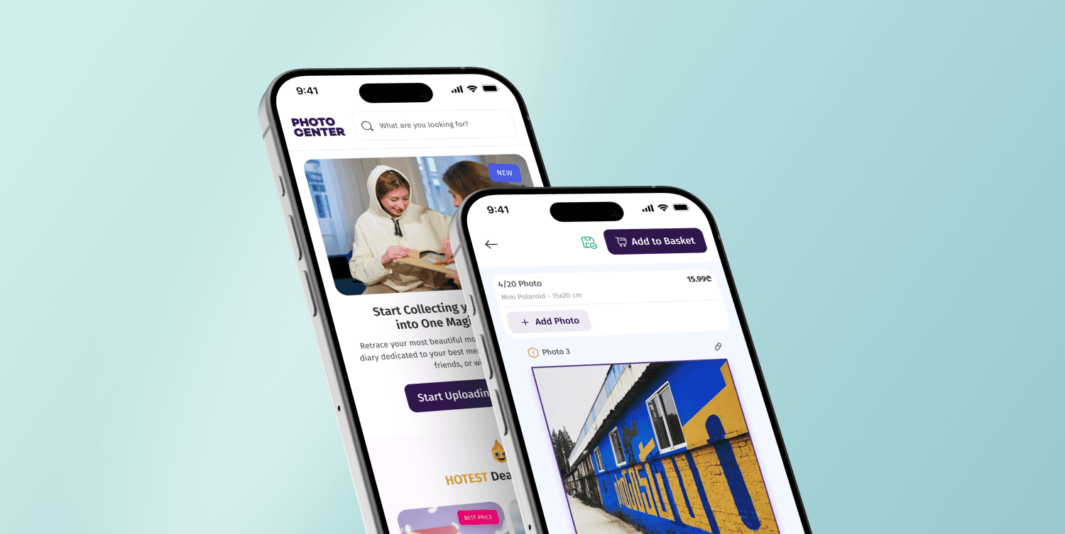
The existing website lacked CTAs, especially for viewing all products. Now, I’ve ensured that users have easy access to this feature throughout the homepage.
Since users in Georgia are not very familiar with automated printing services, especially when they face photo editors, I decided to include guided tours when users first come to the editor. This ensures they understand how to use the features and get the best results.
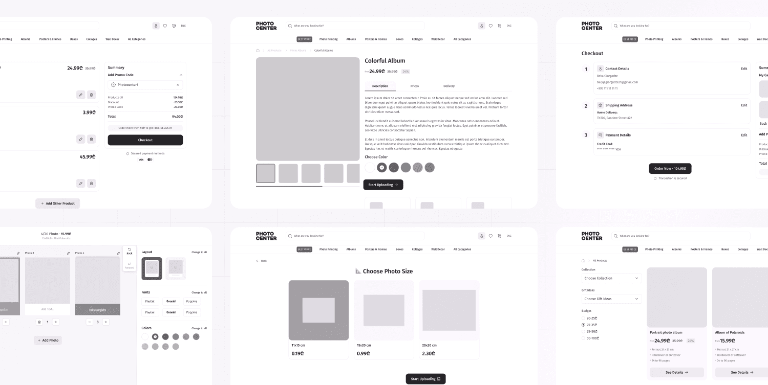
Wireframes:
After gathering all that information, I began working on wireframes. This step in the design process was crucial, as it helped avoid major UX mistakes. It's much less painful to make changes in wireframes than in the actual design 😄
Interface Design:
Time for the fun part! Since I already worked on the photocenter and know who their users are, what they like, and how the photocenter as a brand looks, this part of the process went very well!
Design Testing:
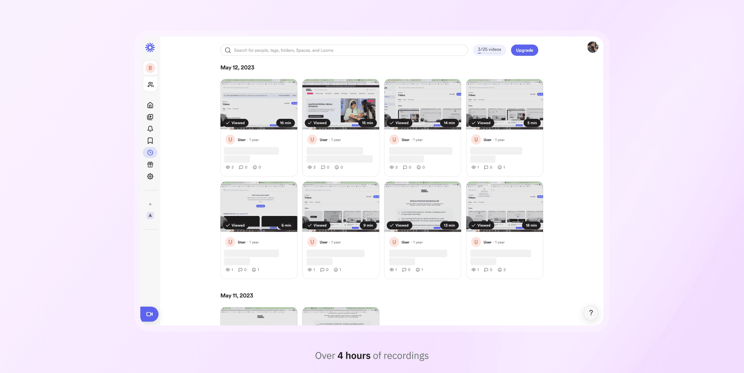
Step by step, I conducted design testing with around 20 users. These included Photocenter employees, friends and family, and current users who had recently placed orders or frequently order from Photocenter. This diverse group provided valuable insights and feedback throughout the process.
I tested the designs at different stages to ensure a seamless user experience:
Before the Photo Editor: I observed how users navigated the website, found their products, added preferences (color/size), and added items to the cart.
Photo Editor: This was one of the most important screens, where users needed a very smooth experience. I gave them tasks involving key functionalities like uploading photos, rearranging, adding text, changing colors, duplicating, and more.
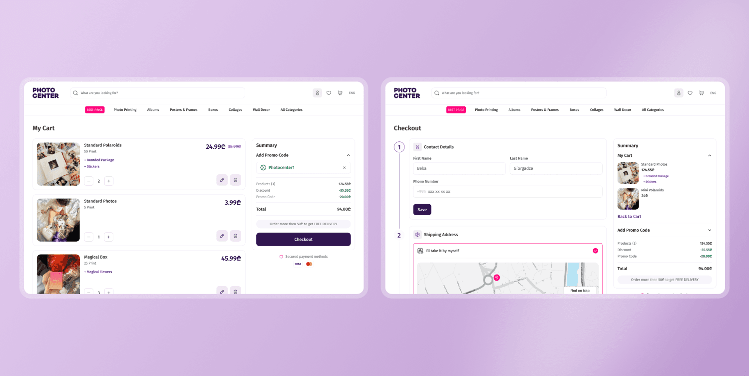
Checkout: This was a significant pain point for users, recently, all the checkout steps were on the same page, making it difficult to scan information. I focused on improving this area to streamline the process.
Full Flow: I tested the entire process from start to finish to ensure everything worked together seamlessly.
The results were amazing—almost everything was clear to the users. I made a few small tweaks to the design and then began working on the mobile screens.
Mobile Design:
I decided to make adaptive design for mobile instead of just responsive to make experience way smoother. I added the navigation bar instead of just burger menu, which helps user to navigate through the main functionality way easier. Users loved the feeling of the app
Summary:
Redesigning your own work is always challenging, but it has been an honor and a great experience. Thank you, Mariam (Founder), for choosing and trusting me again! I hope our paths cross again in the future!
The website is still in the development phase but will be live soon. (I'll provide the link once it's launched.)
Mariam Tsintsadze
CEO
Working with Beka has been comfortable and transformative for our team and company. Beka's successful handling of the project's main challenges, such as designing a new e-commerce platform that could confidently compete with the top 10 e-commerce stores in the Georgian market, has significantly elevated our company's position. His implementation of complex functional solutions for the photo center's e-commerce while maintaining maximum simplicity in design has profoundly impacted our team's capabilities. Throughout the project, Beka listened to our vision and contributed to its development through continuous in-depth analysis of the existing e-commerce environment. Finally, I must highlight his punctuality and, more importantly, his meticulous approach to meeting announced project deadlines. Thank you for everything, Beka. We will undoubtedly collaborate again!
